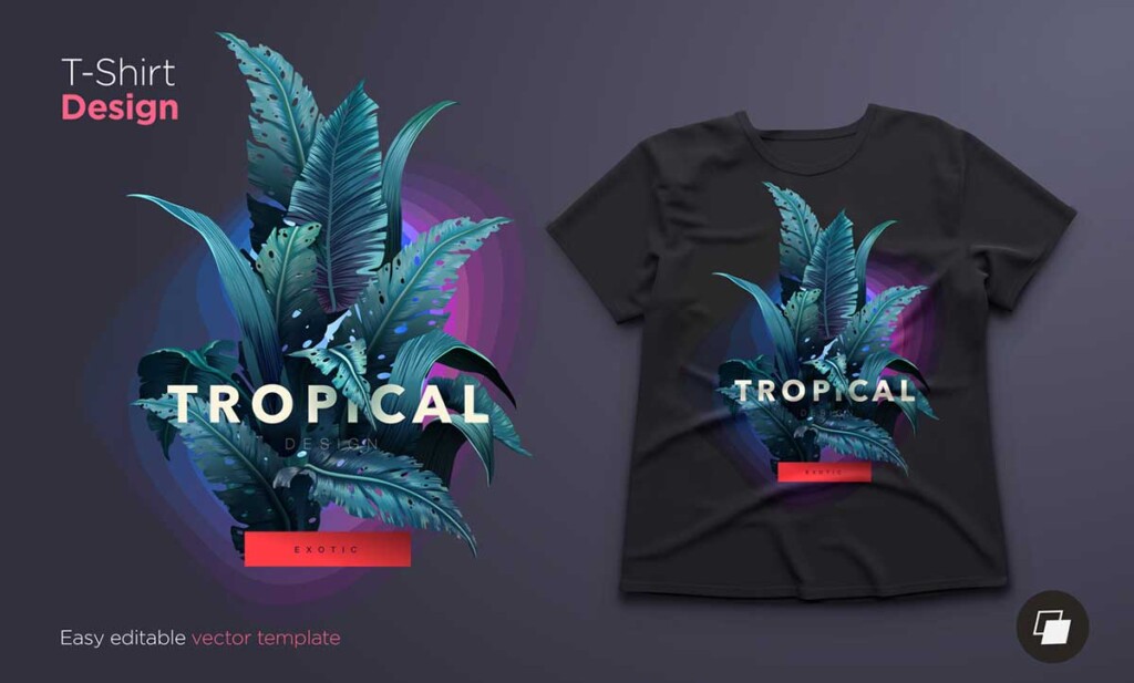
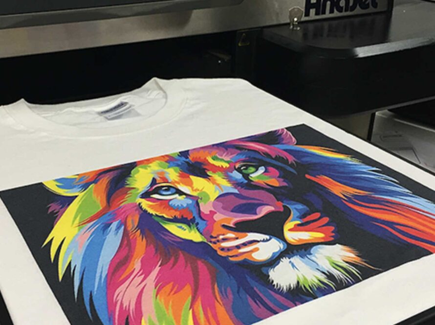
Creating eye-catching designs for printed t-shirts requires a key approach that begins with a deep understanding of your target audience. Knowing their demographics, interests, and preferences can significantly impact your design choices. From selecting the right color palette to employing effective typography, each element plays a vital role in making a design stand out. Incorporating graphics and icons that resonate with your audience while maintaining a balanced layout is also significant. Staying abreast of current design trends can also provide valuable insights. Additionally, the quality of the materials used can enhance a design from good to exceptional.
Key Takeaways
- Use contrasting colors to ensure the design stands out and catches the viewer’s eye.
- Select high-resolution graphics and icons to maintain clarity and detail when printed.
- Implement effective typography that aligns with the design theme and enhances readability.
- Balance elements and utilize negative space to create a visually appealing composition.
- Stay updated with popular trends to incorporate contemporary and relevant design elements.
Understanding Your Audience
Before embarking on the journey of creating printed T-shirts, it is vital to thoroughly grasp the preferences, demographics, and unique characteristics of your target audience. Knowing who you are designing for is the foundation of creating captivating and marketable products. Delve deeply into the psychographics of your audience—what are their interests, values, and lifestyles? These elements will guide the themes, messages, and imagery that resonate most effectively.
Understanding age groups is equally pivotal. Millennials might lean towards bold, statement graphics, while Gen Z may prefer minimalistic or meme-inspired designs. Geographic locations also play a significant role; urban dwellers may have different tastes compared to those in rural areas. Gender preferences, cultural backgrounds, and purchasing power are other important factors to take into account.
Engage with your audience through surveys, social media interactions, and trend analysis. Tools like Google Analytics and social media insights can provide invaluable data on what your audience is currently responding to. Armed with this knowledge, you can tailor your designs to meet their desires, creating T-shirts that not only look good but also feel like an authentic extension of the wearer’s identity. This targeted approach ensures your designs stand out in a crowded market.
Choosing the Right Colors
Selecting the perfect colors for your printed T-shirts is an art that combines psychological insight with design precision. By understanding color psychology, harmonizing schemes, and leveraging contrast, you can create visually striking and emotionally resonant apparel. This section will guide you through the nuances of color choice to enhance your T-shirt designs to a professional level.
Understand Color Psychology
Understanding the psychology of color is pivotal in selecting hues that not only capture attention but also resonate emotionally with your target audience. Colors evoke specific feelings and associations, making them powerful tools in the design process. By understanding the emotional impacts of different colors, you can create t-shirt designs that speak directly to your audience’s desires and aspirations.
Consider these common color associations to guide your choices:
- Red: Conveys energy, passion, and excitement. Ideal for designs meant to inspire action and enthusiasm.
- Blue: Evokes calmness, trust, and reliability. Perfect for designs aimed at establishing a sense of peace and dependability.
- Yellow: Represents happiness, creativity, and warmth. Excellent for designs that seek to uplift and energize.
- Green: Symbolizes nature, growth, and harmony. Suited for designs that promote health, balance, and eco-friendliness.
- Black: Exudes sophistication, power, and elegance. Ideal for sleek, modern designs that aim to make a bold statement.
Harmonizing Color Schemes
Incorporating the principles of color harmony is essential in creating visually appealing t-shirt designs that not only capture attention but also maintain a cohesive and balanced aesthetic. The art of harmonizing color schemes requires an understanding of how different hues interact and complement each other. Utilizing color theory, designers can craft palettes that evoke the desired emotions and fit the brand’s identity.
Start by selecting a primary color that resonates with the message you wish to convey. This foundational hue will set the tone for the rest of your design. Complementary colors, found on the opposite ends of the color wheel, can add vibrancy and energy, while analogous colors, sitting adjacent to each other, offer a more subdued and harmonious feel. Triadic color schemes, using three evenly spaced colors on the wheel, can provide a balanced yet dynamic look.
When choosing colors, consider the fabric’s base color as it can influence the final appearance of your design. Experiment with digital tools to preview various combinations and ensure legibility and visual appeal. Remember, the goal is to create a design that feels unified and expressive, resonating with an audience that values creativity and individuality.
Contrast for Visual Impact
Harnessing the power of contrast is pivotal in creating t-shirt designs that command attention and engage viewers. Contrast is the art of juxtaposing elements to highlight their differences, thereby enhancing visual impact. When selecting colors for your t-shirt designs, leveraging contrast efficiently can transform an ordinary graphic into a striking masterpiece.
To achieve this, consider these essential strategies:
- Bold vs. Subdued: Pairing a vibrant hue with a muted tone can create a dynamic focal point that draws the eye.
- Light vs. Dark: Utilizing light text on a dark background or vice versa guarantees readability and adds visual intrigue.
- Complementary Colors: Opposite hues on the color wheel, such as blue and orange, create a vibrant, high-energy effect.
- Warm vs. Cool: Combining warm colors (reds, oranges) with cool colors (blues, greens) can evoke emotional depth and balance.
- Texture and Solid: Mixing textured patterns with solid colors can add dimension and interest to your design.
Effective Use of Typography
Mastering the art of typography is essential for creating visually appealing and impactful printed T-shirts. Typography goes beyond mere text; it is an art form that conveys emotion, personality, and message. Selecting the right font is paramount. Choose typefaces that resonate with the tone of your design—be it playful, edgy, or sophisticated. For instance, a bold, sans-serif font may exude strength and modernity, while a fanciful script can add a touch of elegance or fun.
Equally important is the hierarchy in your text. Establish a clear structure by varying font sizes, weights, and styles to guide the viewer’s eye through the design. This ensures that the most important elements capture attention first. Additionally, consider kerning and leading to enrich readability and visual appeal. Proper spacing can transform a cluttered design into one that breathes and engages.
Colors also play a significant role. Harmonize your typography with the overall color scheme of your T-shirt to maintain balance and cohesion. To conclude, don’t shy away from experimenting. Typography offers infinite possibilities—embrace them to create designs that are not just seen, but remembered. This is your canvas; let your creativity run wild.
Incorporating Eye-Catching Designs (Graphics and Icons)

Incorporating graphics and icons into your t-shirt designs necessitates a meticulous selection of elements that resonate with your target audience. By selecting appropriate icons, balancing colors and shapes, and ensuring high-resolution quality, you can create visually striking and marketable apparel. Let’s delve into how these factors contribute to the overall impact and appeal of your printed t-shirts.
Choosing Appropriate Icons
Selecting the appropriate icons is crucial, as they not only improve the visual appeal of your printed t-shirts but also effectively communicate the intended message to your target audience. Icons serve as a universal language, transcending barriers and resonating with a diverse audience. They can encapsulate complex ideas into simple, recognizable symbols, making your design more impactful and memorable.
To master the art of choosing the right icons, consider the following tips:
- Relevance: Icons should be directly related to the theme or message of your t-shirt design. Choose symbols that reinforce your concept and resonate with your audience’s values and interests.
- Simplicity: Opt for clean, uncomplicated icons that can be easily recognized at a glance. Overly intricate graphics may lose their effectiveness when scaled down.
- Contrast: Guarantee your icons stand out against the background of your t-shirt. High contrast between the icon and the fabric color enhances visibility and impact.
- Consistency: Maintain a consistent style throughout your design. Whether you prefer minimalist line icons or detailed illustrations, uniformity ensures a cohesive look.
- Symbolism: Use icons that evoke emotions or ideas. Symbols have powerful associative meanings that can amplify your message and connect with your audience on a deeper level.
Balancing Colors and Shapes
Once you’ve chosen the appropriate icons, the next step is to skillfully balance colors and shapes to make sure your t-shirt design is visually appealing and cohesive. Start by selecting a color palette that resonates with the theme of your design. Use color psychology to evoke emotions and connect with your audience. Consider complementary colors to create contrast and harmony, ensuring the icons stand out without overwhelming the design.
Shapes play an essential role in guiding the viewer’s eye. Utilize geometric shapes to create structure or organic shapes for a more fluid and dynamic feel. The arrangement of these shapes and icons should lead to a visually balanced composition. Think of the Rule of Thirds; positioning your elements along these lines or intersections can create a more engaging design.
Incorporating graphics and icons requires mindful spacing. Too cluttered, and your message gets lost; too sparse, and it lacks impact. Finding the sweet spot in spacing will make your t-shirt not only eye-catching but also stylish and memorable. Remember, the goal is to create a design that feels free-spirited yet meticulously crafted, resonating with an audience that values both creativity and precision.
Ensuring High-Resolution Quality
Achieving high-resolution quality in your t-shirt designs demands meticulous attention to detail, especially when incorporating intricate graphics and icons. Ensuring that your visuals are crisp and clear on fabric demands a blend of creative flair and technical expertise. The first step is to work with vector graphics whenever possible. Unlike raster images, vectors maintain their integrity at any size, guaranteeing sharpness and precision.
To transform your vision into reality, consider these essential tips:
- Vector Formats: Use vector formats such as .AI, .EPS, or .SVG for your designs. These formats guarantee that your graphics scale without losing quality.
- Resolution Standards: Maintain a minimum resolution of 300 DPI (dots per inch) for raster images. This standard is vital for high-quality prints.
- Color Modes: Design in CMYK color mode if your printer requires it. This mode ensures that the colors in your design translate accurately to the printed product.
- Software Tools: Utilize industry-standard software like Adobe Illustrator or CorelDRAW. These tools offer advanced features to refine your designs.
- Detail Review: Zoom in on your designs to inspect and refine intricate details. This practice helps in catching flaws that might not be visible at the original scale.
Balancing Elements and Space
Balancing elements and space on a printed T-shirt involves a nuanced understanding of visual hierarchy and composition to create a harmonious and impactful design. The key lies in distributing visual weight effectively across the canvas, ensuring neither overcrowding nor vast emptiness. Start by identifying the focal point of your design—this could be an image, text, or a combination of both.
Once the focal point is established, consider the surrounding negative space. Negative space, often essential, is vital for allowing the design to breathe and stand out. Think of it as the silent beat in music; it gives rhythm and emphasis to the core elements.
Moreover, symmetry and asymmetry both have their place. Symmetrical designs can convey balance and stability, while asymmetrical compositions can evoke dynamism and freedom, appealing to an audience that values individuality.
Scale and proportion also play pivotal roles. Varying the sizes of elements can create depth and interest, guiding the viewer’s eye naturally across the design. Pay attention to alignment and spacing, as even slight misplacements can disrupt the overall aesthetic. Remember, a well-balanced T-shirt design is not just seen but experienced, resonating with the wearer’s sense of freedom and creativity.
Utilizing Popular Trends
Consistently tapping into popular trends can greatly enhance the appeal and marketability of your printed T-shirt designs. Staying attuned to cultural shifts and emerging styles guarantees that your creations remain relevant and sought-after. Here are some key strategies to keep your designs in vogue:
- Street Art Influence: Incorporating graffiti and urban art elements can resonate with a younger, rebellious audience.
- Retro Revivals: Nostalgic designs from the ’80s and ’90s, such as bold neon colors and vintage graphics, can attract those who cherish the past.
- Minimalist Aesthetics: Clean lines and simple typography appeal to those who favor understated elegance and modernity.
- Pop Culture References: Leveraging iconic movies, music, or viral internet phenomena can instantly connect with a broad audience.
- Eco-Friendly Messaging: Designs that promote sustainability and environmental consciousness cater to the growing market of eco-aware consumers.
Selecting Quality Materials
Selecting the appropriate materials for your printed T-shirts is crucial to guarantee both the longevity of the print and the comfort of the wearer. The fabric serves as the canvas for your art, and its quality can significantly influence the final product. Opt for high-quality cotton, known for its breathability and softness, ensuring that the wearer feels comfortable and free. Blends of cotton and polyester are also popular, providing durability and resistance to wrinkling and shrinking while maintaining a light feel.
Equally important is the compatibility of the fabric with the printing technique. For direct-to-garment (DTG) printing, 100% cotton works best as it absorbs the ink well, resulting in vibrant and durable prints. For heat transfer or screen printing, a cotton-polyester blend can be more economical and still yield excellent results.
Don’t overlook the weight and texture of the fabric. Lightweight fabrics are ideal for summer wear, whereas medium to heavy-weight fabrics offer a more structured look, suitable for cooler climates or layered outfits. Finally, always consider sustainable options, like organic cotton or recycled materials, to cater to the eco-conscious consumer, aligning your brand with values of freedom and responsibility.
Testing and Revising Designs
Once you’ve chosen the right materials, the next step is to rigorously test and refine your designs to guarantee they meet both aesthetic and practical standards. This phase is essential for ensuring that your t-shirt designs not only look good but also stand up to the rigors of everyday wear. Begin by creating prototype prints and scrutinizing them under various conditions. Pay close attention to color accuracy, print alignment, and fabric compatibility. Here’s a checklist to guide your testing process:
- Color Fastness: Wash the prototype multiple times to make sure colors remain vibrant and do not bleed.
- Durability: Stretch the fabric to see if the design cracks or peels, ensuring longevity.
- Comfort: Wear the t-shirt under different conditions to evaluate comfort and breathability.
- Print Quality: Examine the design for any misprints or inconsistencies.
- Feedback: Gather opinions from a diverse group to refine the design further.
Frequently Asked Questions
How Do I Price My Custom Printed T-Shirts for Sale?
To price custom printed t-shirts effectively, consider your production costs, including materials, labor, and printing. Research competitor pricing to guarantee competitiveness. Factor in profit margins and potential discounts for bulk orders. Balance affordability with quality to attract discerning customers who value both freedom of expression and craftsmanship. Transparent pricing can build trust and loyalty, fostering a community that appreciates unique, well-made apparel.
What Software Is Best for Creating T-Shirt Designs?
When selecting software for creating t-shirt designs, consider Adobe Illustrator and CorelDRAW for their robust vector graphic capabilities. These tools offer precision and scalability, essential for high-quality prints. For beginners seeking ease of use, Canva provides a user-friendly interface with ample design resources. For those desiring a blend of creativity and technical expertise, Affinity Designer serves as a budget-friendly alternative with professional-grade features.
How Can I Protect My T-Shirt Designs From Being Copied?
Imagine your designs as mythical treasures guarded by dragons. To protect your t-shirt masterpieces from being copied, start by registering your designs with copyright authorities, ensuring your intellectual property rights. Utilize watermarks on digital images and consider adding unique, hard-to-replicate elements. Employ legal contracts for partnerships and sales agreements. These steps fortify your creative freedom, safeguarding your artistic expression against unauthorized duplication.
Should I Consider Using Eco-Friendly Printing Methods?
Considering eco-friendly printing methods is a commendable choice, particularly in today’s environmentally conscious market. Embracing sustainable techniques not only reduces your carbon footprint but also resonates with a growing demographic that values ecological responsibility. Methods such as water-based inks, organic fabrics, and energy-efficient processes can elevate your brand’s appeal and contribute to a positive impact on the planet, aligning your business with the principles of freedom and innovation.
What Are the Best Printing Techniques for Vibrant Colors?
Imagine a festival-goer wearing a t-shirt with colors so vivid, it feels like a personal fireworks display. To achieve this, Direct-to-Garment (DTG) printing is an excellent technique. DTG allows for intricate designs with a spectrum of vibrant colors and fine details. Its water-based inks are not only eco-friendly but also provide a soft, breathable finish, satisfying both aesthetic desires and environmental consciousness.


